Qubic IT Solutions
Brand & Website for IT Service Company
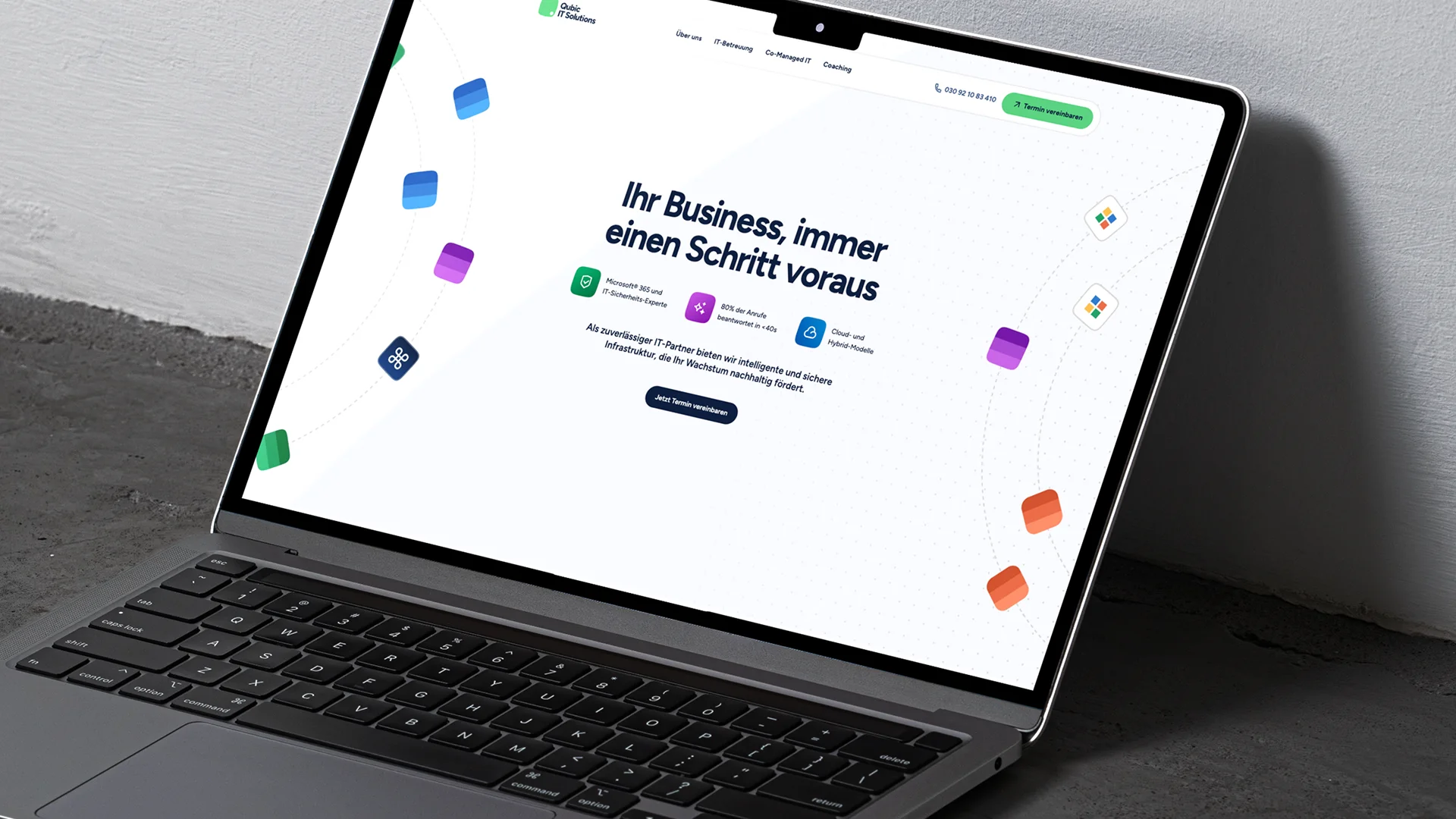
«I’m going to build an IT company that is more than a utility – I want to offer true value to my clients. And I need the brand to reflect that» – Christopher Flowers assignment was clear: A positive, recognizable, yet fun brand. How could we help create a tech service brand that is cool, but stays a bit nerdy?
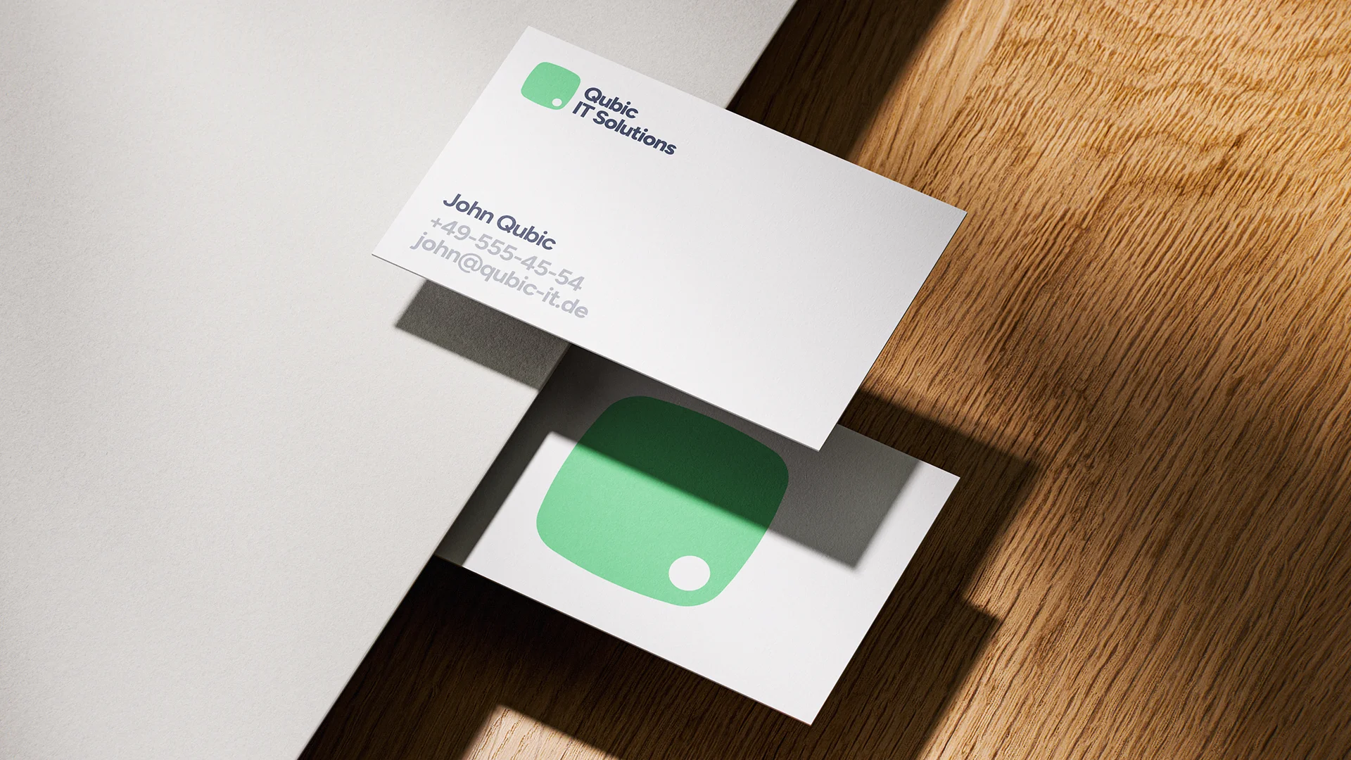
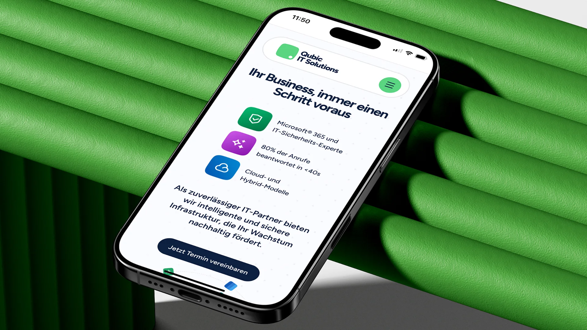
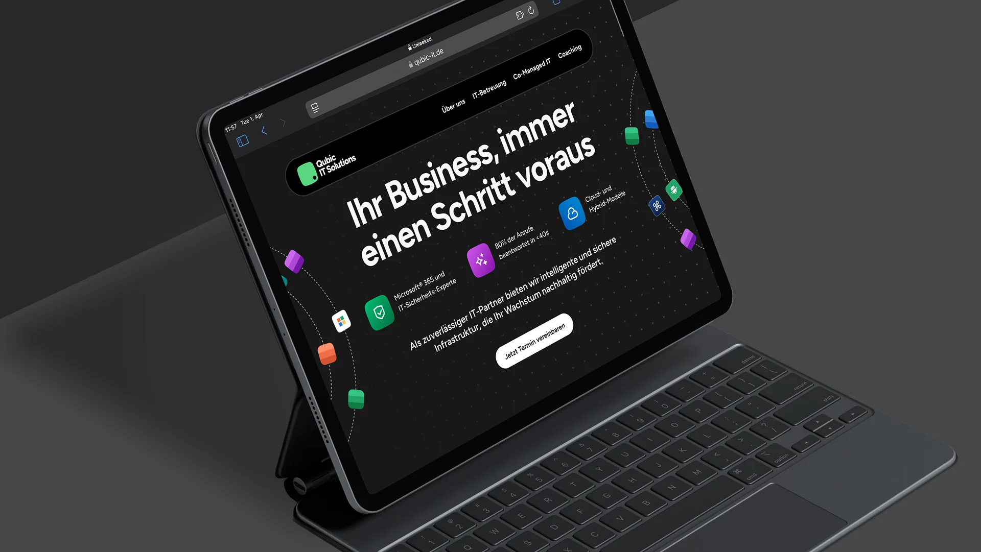
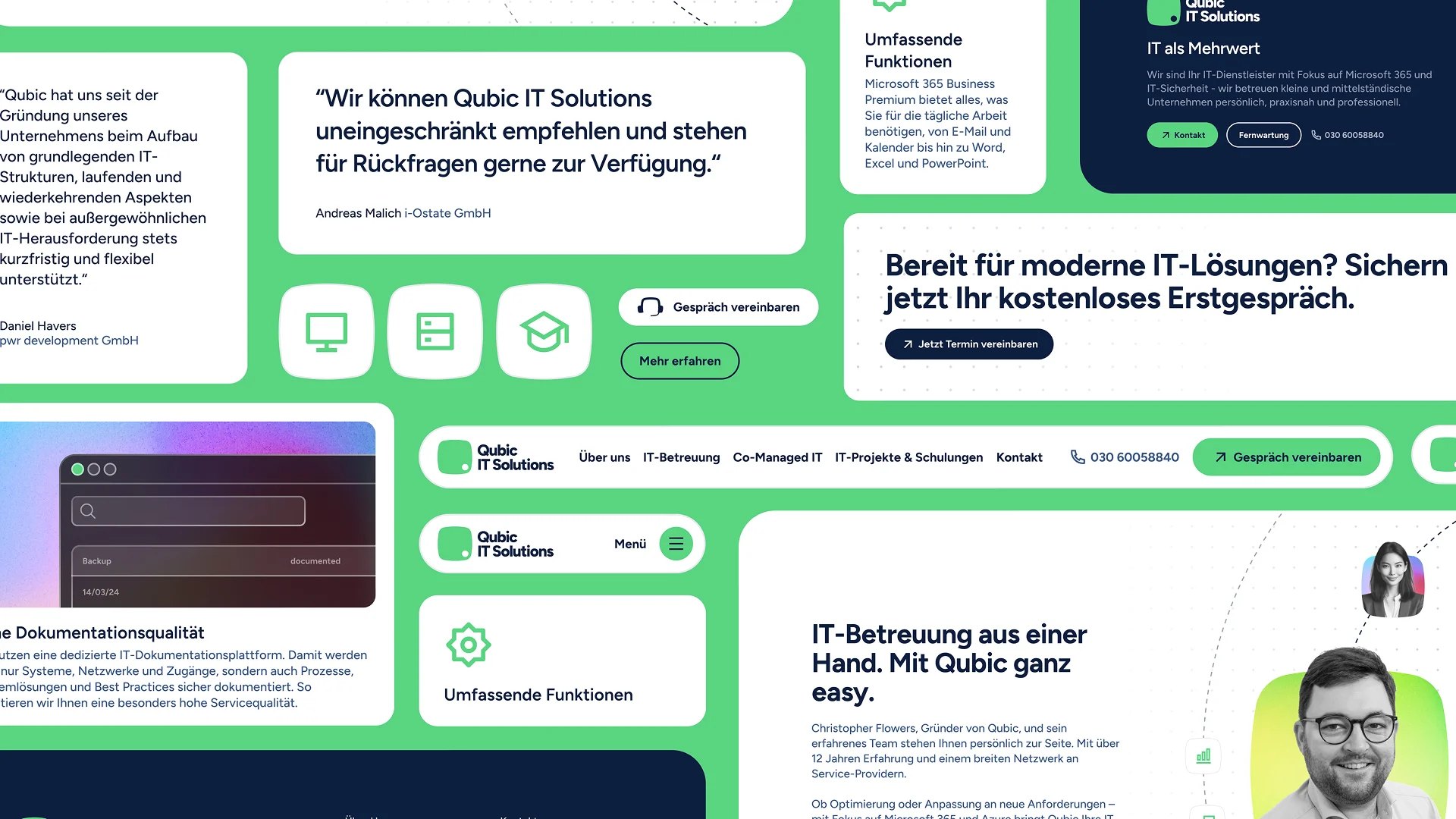
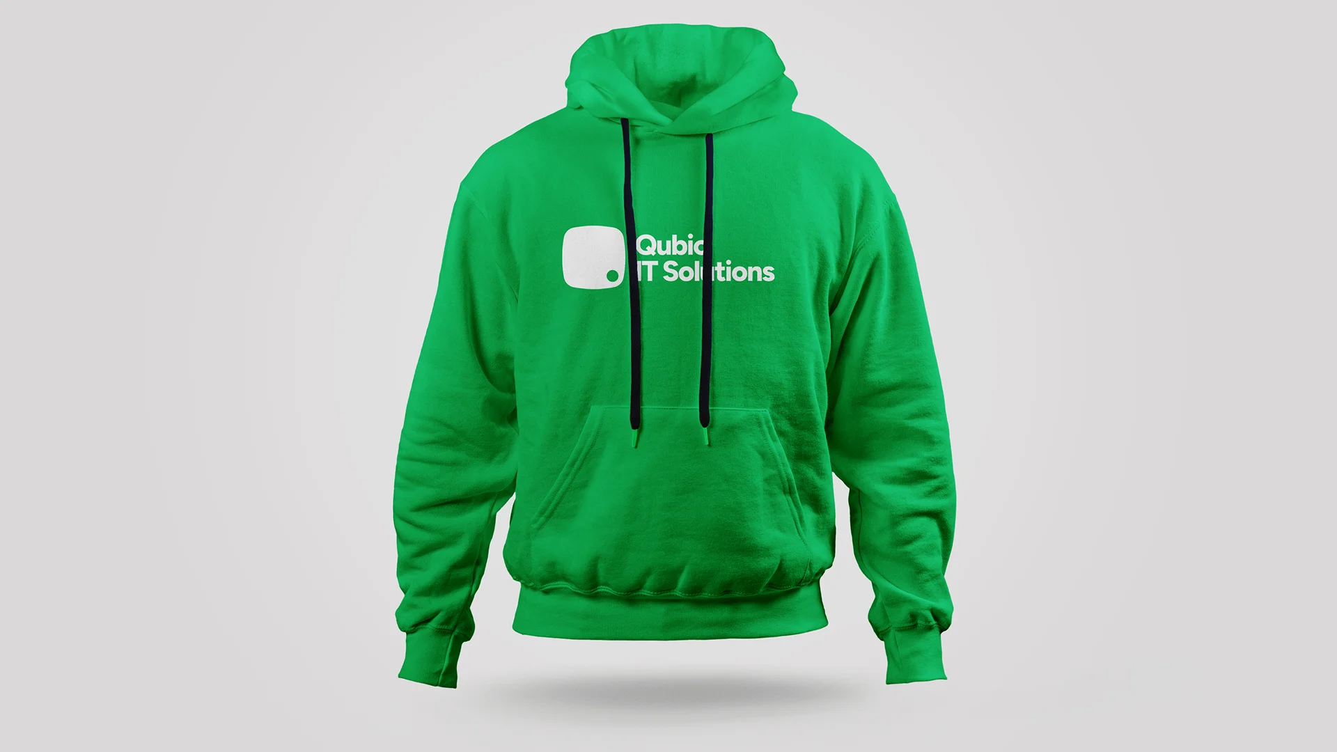
We started the project with a naming workshop. Over two sessions, we turned his company values personality, practice & professionalism into a unique name: Qubic. The minimalist and bold Q, now also known as the «Quirkle» would become the center of the brand – no matter if in icon design, on business cards or combined with some quirky references, it becomes ultimatively recognizable – just how a logo should be.

- Client: Qubic IT Solutions GmbH
- Industry: Technlogy
- Project Lead: Johannes Ippen
- Published: 2025